Improved Reporting 
for Lawn Care Companies
UX/UI
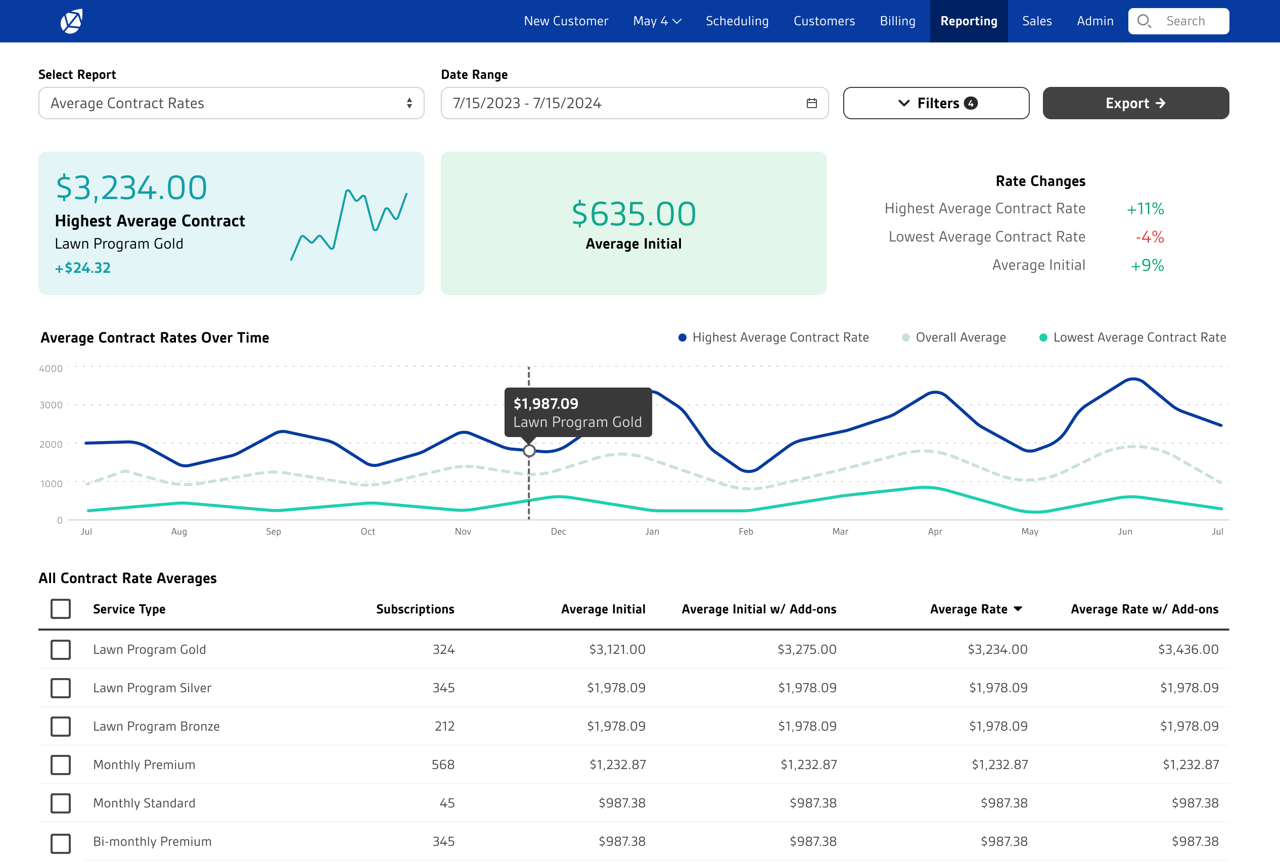
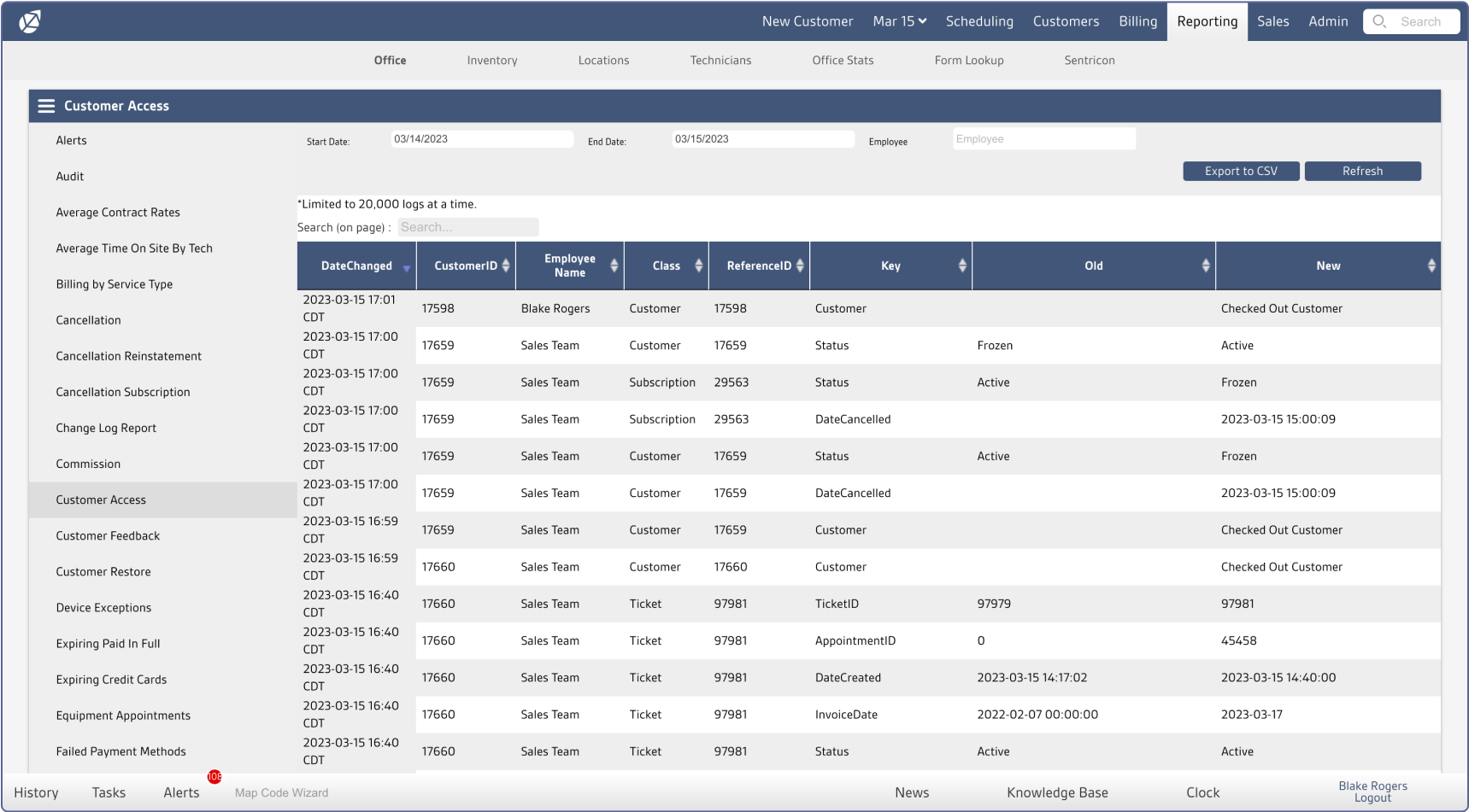
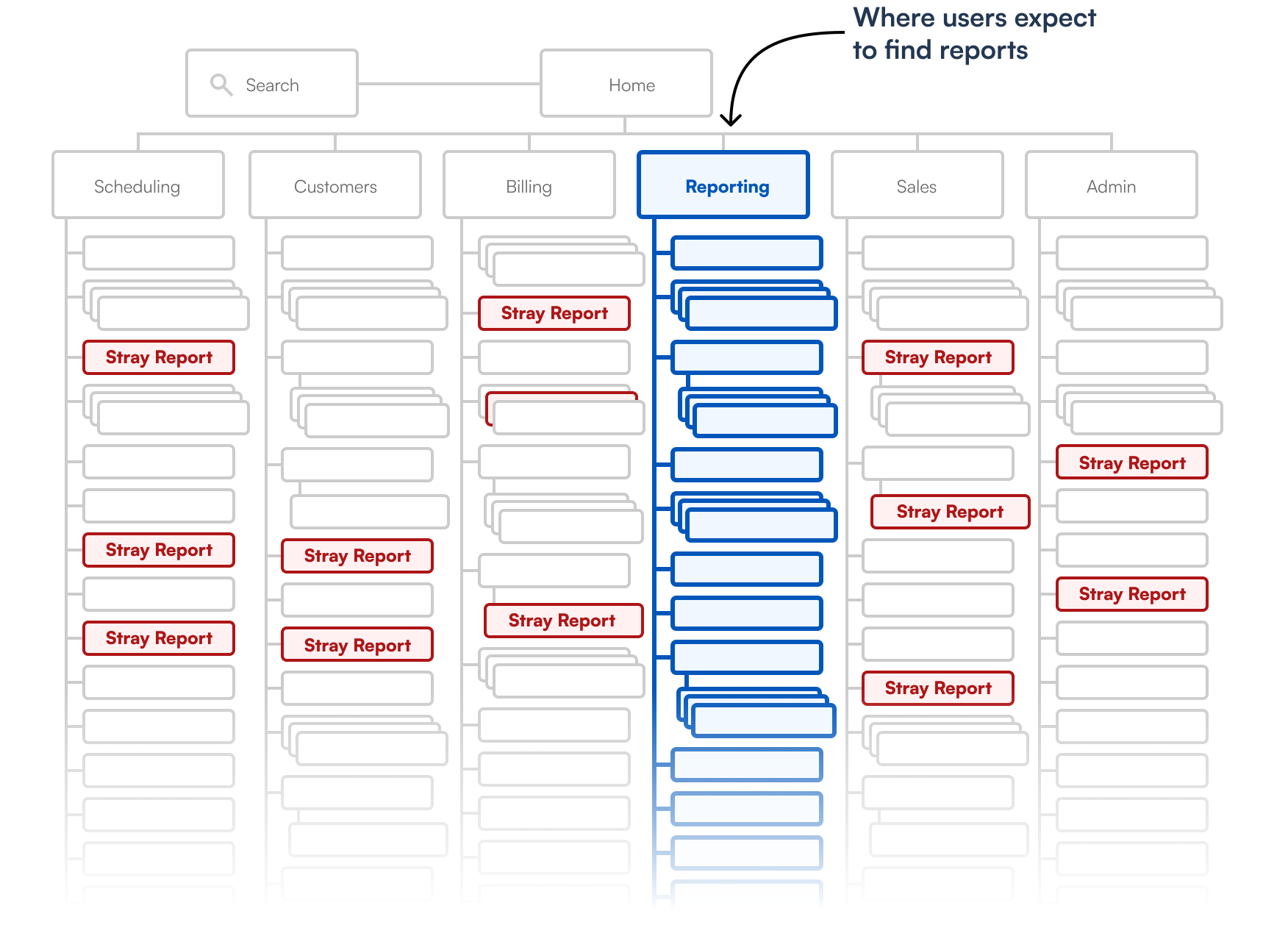
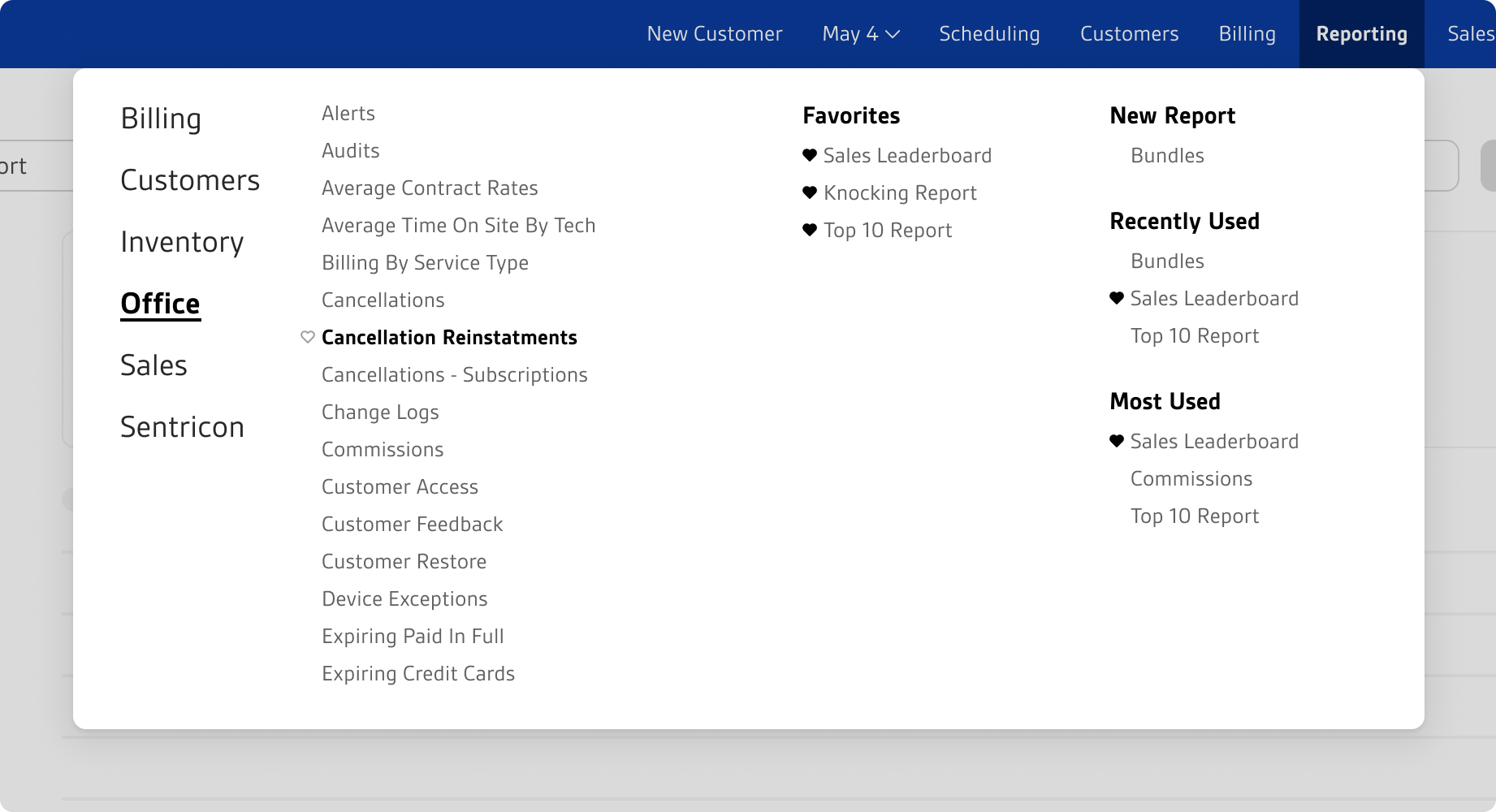
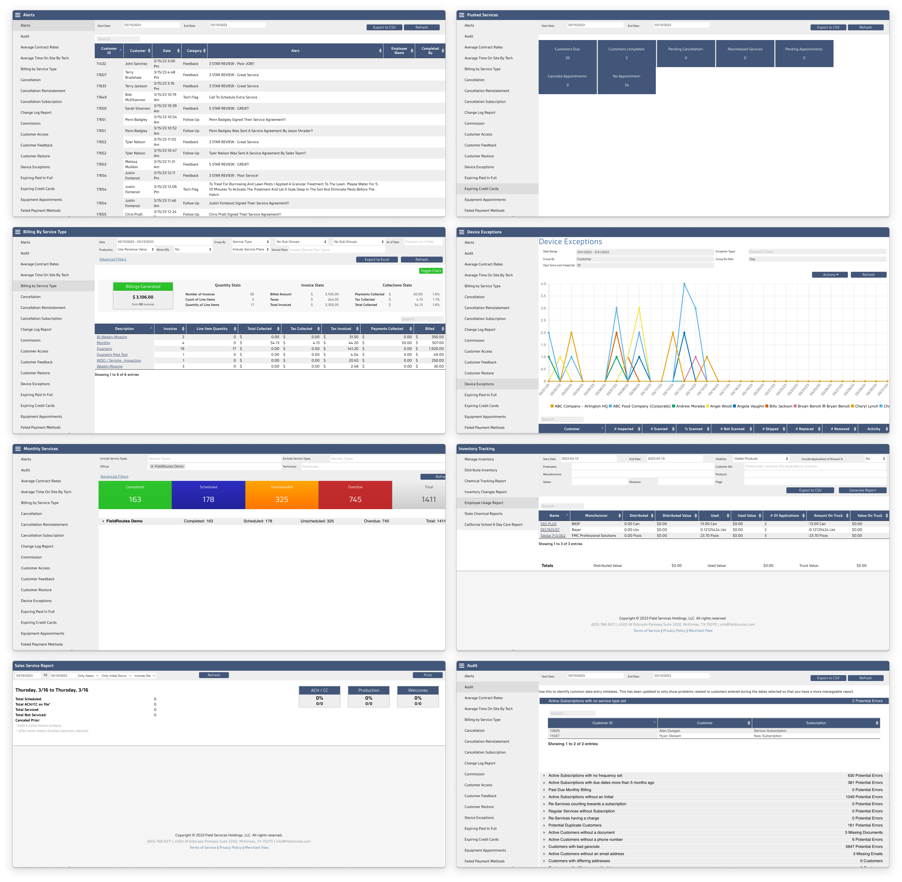
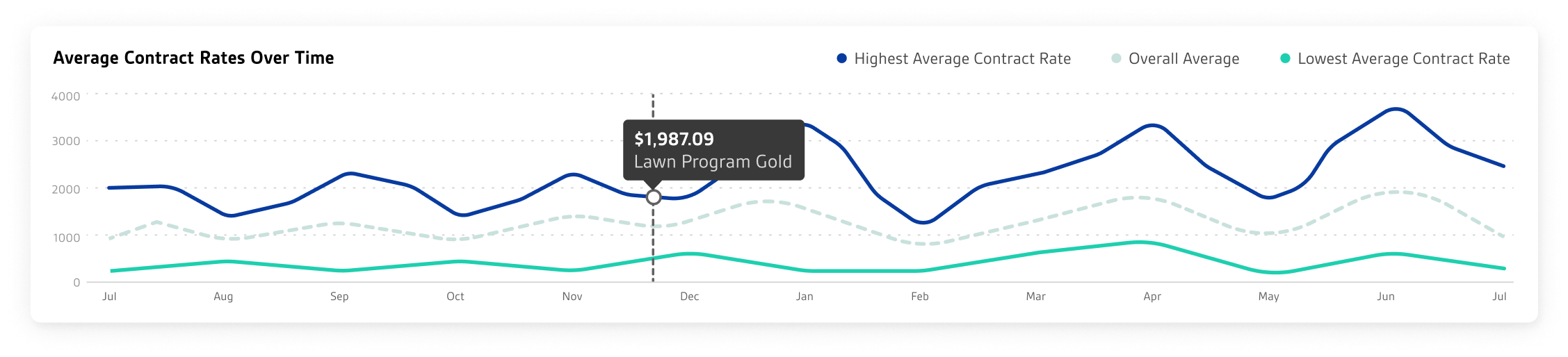
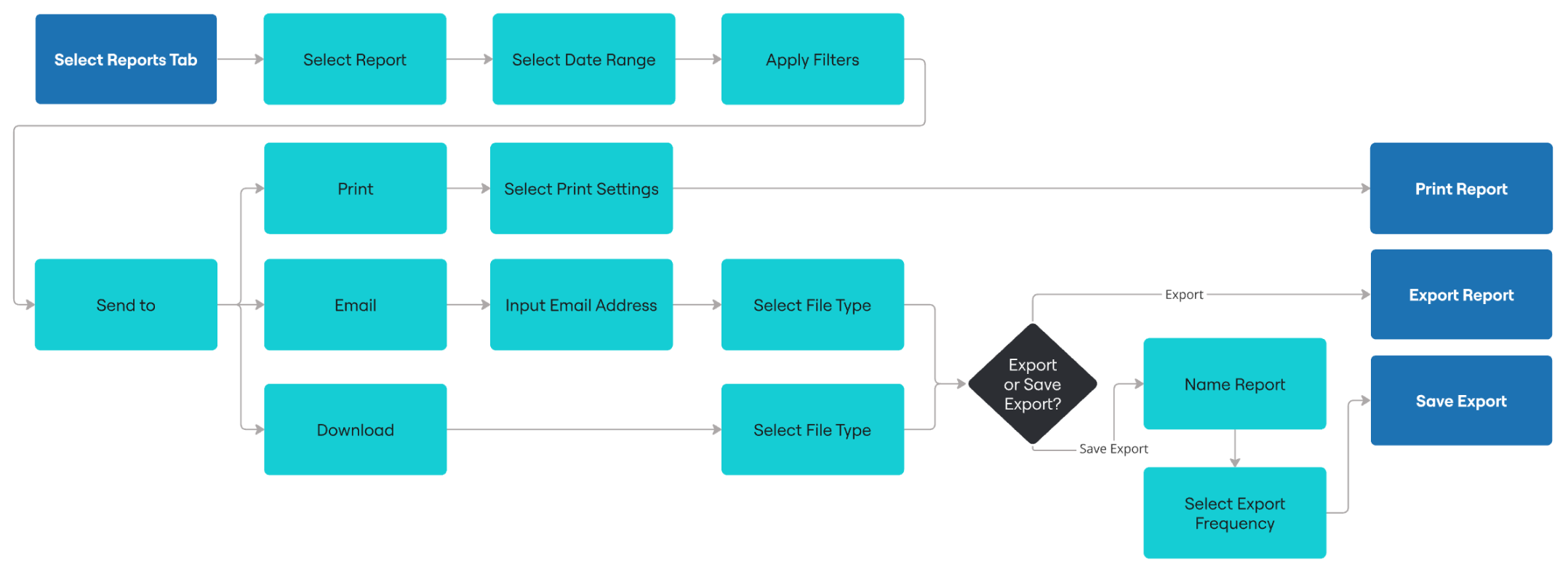
Field Routes, a SaaS platform for lawn care companies, was receiving a growing number of complaints about the 100+ reports in it’s OpsConsole product. Lack of features made FieldRoutes lose out against competition which increased churn. The poor learnability of reports incurred hidden costs such as expensive training and increased customer service tickets. Additionally, engineering resources were scarce, leaving little capacity to fix 100+ report screens.
Sample of FieldRoute’s existing reports
Objective
Research, strategize and design a lovable and learnable reporting experience(using minimal engineering resources)
Problem 1
Discovery
Design
Confusing information architecture
For over a decade, reports were added willy-nilly to any top level tab instead of the Reporting tab. If you go to the Reporting tab, don’t expect to find all the reports.
Problem 1
Discovery
Design
Customers declare discoverability their biggest pain point
In addition to being frequently mentioned in customer interviews, 67% of respondents to an in-app survey expressed difficulty in finding reports.
Problem 1
Discovery
Design
Reorganize Reporting tab without disruption
Customers invest heavily in training, developing strong habits around where to find things. That’s why we honored the design value of Non-disruptiveness (otherwise known as the design value of not getting yelled at in our Facebook user group). We avoided disrupting work by keeping stray reports where they are in the familiar structure. Simultaneously, all reports became accessible via the new Select Report mega menu. The addition of Favorites, New Reports, Most Used and Recently Used improved discoverability.
Problem 2
Discovery
Design
Inconsistency impedes learnability
Due to a decade of adding reports with no standards or templating, they were wildly inconsistent. Customers had to learn as many ways to interact with reports as there were reports!
Samples of reporting variants
Problem 2
Discovery
Design
Customers want a consistent reporting experience
In an in-app survey, customers expressed the desire for consistent export options (file type, sending, etc). The inconsistent UI was also frequently cited in negative NPS scores and Facebook posts as making the app hard to learn.
Problem 2
Discovery
Design
Componentize data-viz and templatize workflow
With limited dev resources, a small set of only 4 data-viz components allow custom dashboards for 100+ reports within an otherwise strictly consistent template.
Primary component
Secondary components
Tertiary component
Sample data-viz component combinations
Templatized Reporting Workflow
Problem 3
Discovery
Design
Refine
Competitive disadvantage
Automated reports were included in a competitor’s app, yet we didn’t offer it.
Problem 3
Discovery
Design
Refine
Automation most requested
In an in-app survey, customers requested automation more than any other reporting improvement. A second round of conversations revealed the full extent of their automation needs including files types, export frequency, etc.
Problem 3
Discovery
Design
Refine
Make it automatic
Saved Exports gives customers their requested automated reporting.
Problem 3
Discovery
Design
Refine
Usability testing reveals discoverability issue
I originally placed Saved Exports inside the export tray in an attempt to give it close proximity to the export experience, but usability testing revealed it was too hard to find. Putting it top-level, next to the Export button, retained my intended proximity while increasing discoverability.
IMPACT
100+ custom reports from 1 template and 4 data-viz components